The museums of the world have made a lot of bad apps. These failures have had enough collective negative impact on user trust to make some market experts, such as Colleen Dilenschneider, ponder whether the tainted reputation of museum apps can ever recover enough to allow any new app to succeed.
Call me foolish for holding onto hope, but I’ve long believed that museums can make apps that people will love. However, these apps would have to look very different from the app most museums have on the market — you know, the one called “[Insert museum name] App” that features maps of the museum, what exhibits are on, and “read more” about what didn’t fit on the object label.

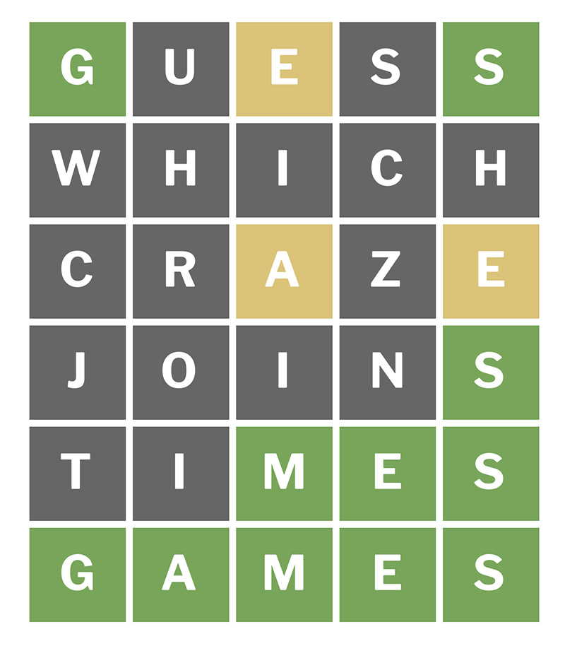
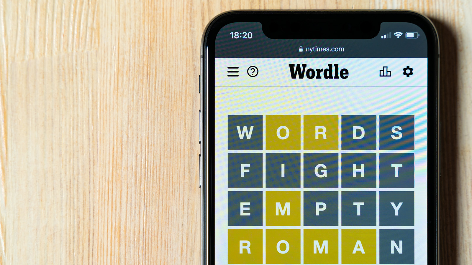
Wordle’s viral popularity has seen it join the New York Times‘ collection of wordplay games like Spelling Bee and its daily crossword. Image: The New York Times
What I’d like to see is for a museum to establish a brand as a producer, with a homegrown portfolio of mission-oriented, mobile-friendly experiences that audiences want to add to their day-to-day lives. For an example of what I mean by such a portfolio, download the New York Times Crossword app, and see how it builds the brand of the New York Times with its diverse offerings of wordplay games.
Which brings me to Wordle. Wordle was recently acquired by the NYT for its Crossword app. It’s a perfect example of what a museum (or the NYT, for that matter) could have done, but didn’t. Still, museums have a great opportunity to learn from what Wordle got right and to apply these learnings to make equally compelling digital experiences for their audiences.
Here’s a checklist of the qualities which I believe made Wordle a success and which would hold true for a great museum app:
- People can use it every day.
- It requires less than 10 minutes of attention per use.
- It provides a predictable but slightly different experience each day (Wordle never changes its UI or what it asks users to do, but it also never repeats the same word).
- It’s relevant to the organization’s mission, but it’s not about the organization and its stuff.
- It’s not trying to solve its organization’s problems (e.g. if your visitors are having trouble navigating your museum, a map app is no solution).
- It doesn’t have to be an “app” — it’s better to make a mobile-friendly browser experience until you have enough of a portfolio to justify an app that lives on users’ phones.
- Its branding allows flexibility to become a part of a larger digital experience portfolio (calling it the “[museum name] app” puts all your eggs in one basket and leaves no room for new products)
“What could an app that isn’t a Wordle copycat look like?” you might ask.
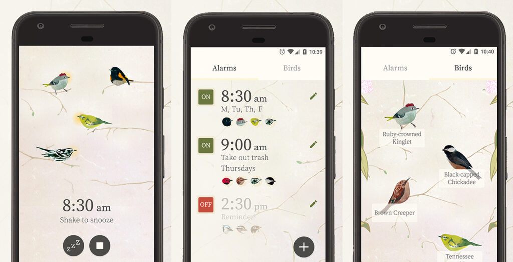
My favorite example of a real product from a museum so far is the Carnegie Institute’s Dawn Chorus, an alarm clock app that lets you wake up every morning to recordings of bird calls from the collection of the Carnegie Museum of Natural History.

Dawn Chorus, an alarm clock app by the Carnegie Museum of Natural History, blends utility with education. Image: Carnegie Museums
Honorable mention goes to the Monterey Bay Aquarium’s Seafood Watch, which helps you make informed choices regarding sustainable seafood when you’re on your phone at a restaurant. I don’t know how many people go out for seafood daily, but the ability to use this tool recurrently outside the aquarium and the fact that it’s a mobile-friendly website (no requirement to keep a mobile app on your phone) earns this one a pass on the “can be used every day” check.
Here are a few more possibilities I can imagine:
- For a science museum: a tracker app (à la diet/fitness apps) that helps you monitor your environmental footprint–how much trash/recycling/compost did I create today? How much water did I conserve?
- For a local historical society: a mobile-friendly interface that lets you submit one photo or question a day about something you’ve seen around town, and the museum replies with a photo or comment that’s relevant to it (akin to Ask Brooklyn Museum in spirit, but the key here is making it usable outside a museum’s own space)
- For an art museum: a learn-to-draw or -paint app that gives you one new drawing or painting, which can be completed in less than 10 minutes, to do on your phone each day
This article originally appeared on Why Not Dinosaurs?
Cait Reizman worked with a variety of cultural organizations while earning her M.A. in Museum Studies. She is currently a digitization program manager at Google. Read more of her writing at Why Not Dinosaurs? and find her on Twitter @MuseumAdvocait.


