In 2012, the Museum of Contemporary Art Australia’s (MCA) mobile app arrived, unlocking for its users a host of onsite functionality from wayfinding to audio tours to the occasional AR features. But a few years into it, the institution found that downloads of the app had plateaued, if they weren’t trending downwards, while maintaining the platform was becoming quite the task. A fresh approach to the mobile guide, it decided, was due.
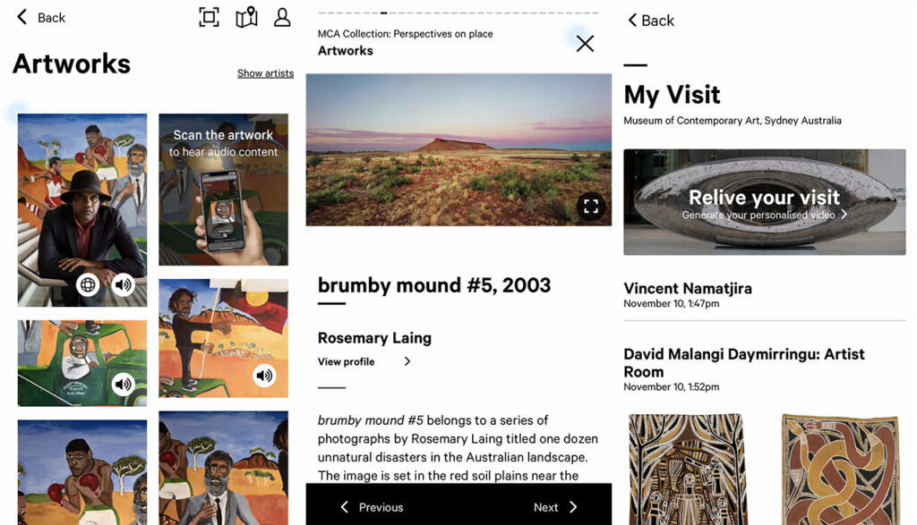
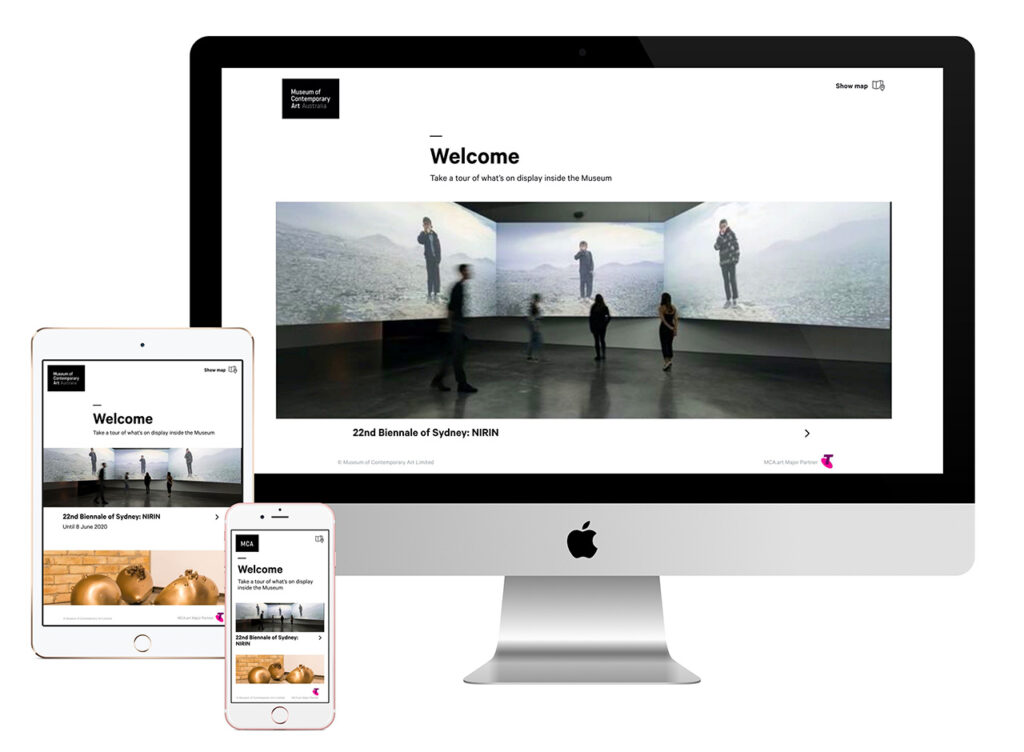
Hence the unveiling of mca.art in August 2019. It’s not another app that requires a download, but a web-based guide that’s accessible on smartphones, tablets, or desktops. MCA visitors simply have to open a browser on their devices and navigate to the web address mca.art. There, they’ll be able to launch an interactive map, scan onsite artworks to access audio guides or virtual tours, and, post-visit, review works and audio tracks they’ve engaged with.

On mca.art, visitors can scan physical artworks to (from left) access audio content, explore works in detail, and revisit artworks and audio tracks they previously engaged with. Images: mca.art
To MCA’s Digital Producer Claude Moelan, mca.art represents an elegant solution to easing friction in the visitor experience. “We want our audience to be able to access content and find more information about the exhibits and artworks without too many barriers,” she tells Jing Culture & Commerce. The platform’s minimal design further reflects its direct, unfussy approach, she adds, to “deliver the content in the easiest way possible to our visitors.”
For what Moelan terms “a big experiment,” at least over its first 18 months, the guide has seen a 20 percent increase in active users from last year and in October, earned a nod from the Australian Good Design Awards for Best in Class in the category of Digital, Web Design, and Development. It’s an honor that the museum shares with mca.art major partner, Telstra, as well as Sydney-based studio Pollen, which designed the the guide’s UX, and digital solutions provider LIVDEO, which built out its multimedia and content management systems, as well as other components from visual recognition to 360-degree virtual reality.
Also key to the success of mca.art is its makers’ willingness to experiment with and constantly evolve the offering. Over its lifetime, the guide has grown in features such as audio tracks that sync up to onsite video artworks, the ability to scan 3D works to call up audio commentaries, and AI-assisted image recognition that works in low-light environments. Accessibility support has been built in in the form of closed captioning and Auslan interpretation on videos.

The award-winning guide was co-created with UX design studio Pollen and digital solutions provider Livdeo, and with major partner Telstra. Image: Livdeo
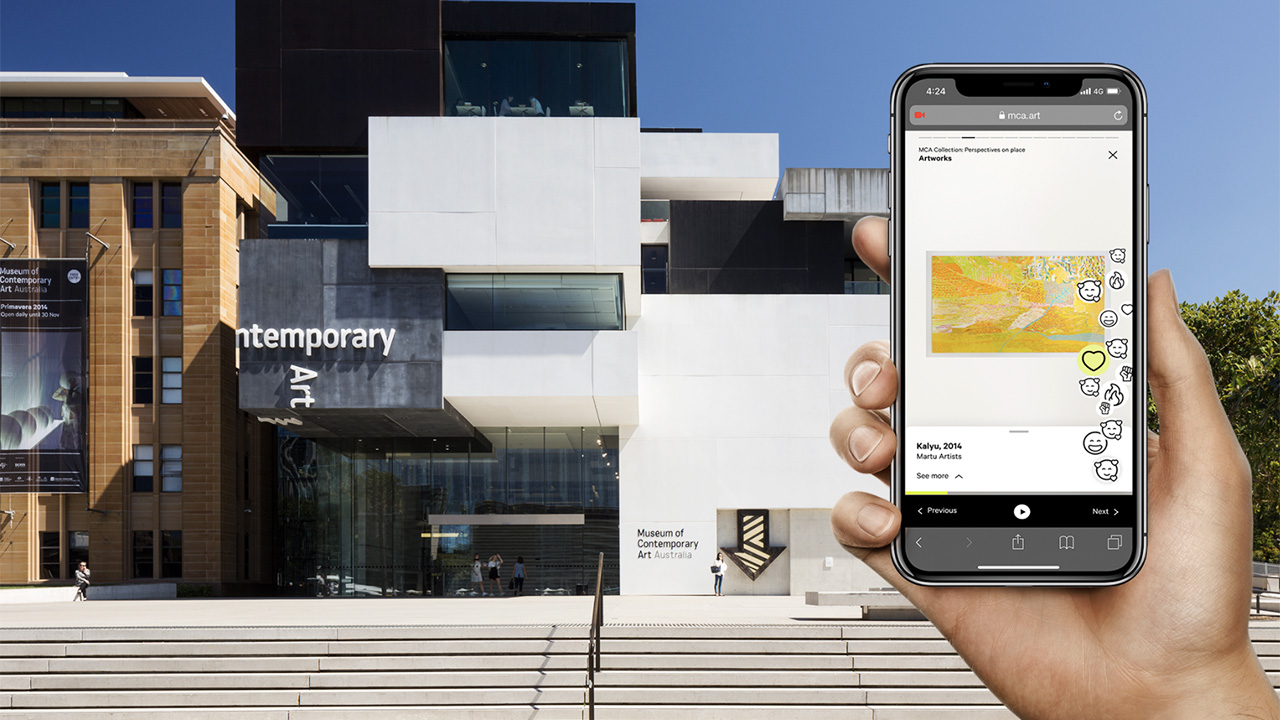
Since May, the mobile guide has been playing host to Your Feelings Welcome, a campaign created in partnership with Ogilvy Sydney and an interactive tool focused on the ongoing exhibition, MCA Collection: Perspectives on place. The feature asks visitors to submit their emotional reactions to the exhibition’s displays by choosing from a selection of 18 emojis (ranging from “magical” to “deadly”) or by leaving a comment. In line with MCA’s mission of making contemporary art more accessible, the campaign, notes Moelan, invites audiences to more deeply engage with the museum’s contents. “It’s almost like a two-way conversation,” she says. “And it really adds that layer of emotion to a work in a way that is meaningful and accessible.”
These responses, in addition to mca.art’s other post-visit data, might go some way to shaping MCA’s programs. With them, says Moelan, the museum could perhaps interview artists whose works are particularly resonant, or offer products based on popular pieces. In this way, mca.art isn’t just centered on visitor experience, but more vitally, centers the visitor.
It is, after all, this “open conversation with the communities that you’re trying to reach,” per Moelan, that should give enduring purpose to museums’ digital ventures. “It can be easy to get lost in like, ‘Oh yeah, that feature will be great,’ without thinking of longevity or whether something will be sustainable in the long run,” she says, when it should be about “taking a step back and reviewing the work that’s been done — what works, what doesn’t — while leaving space to experiment as well.”


